Glass | UI UX Design
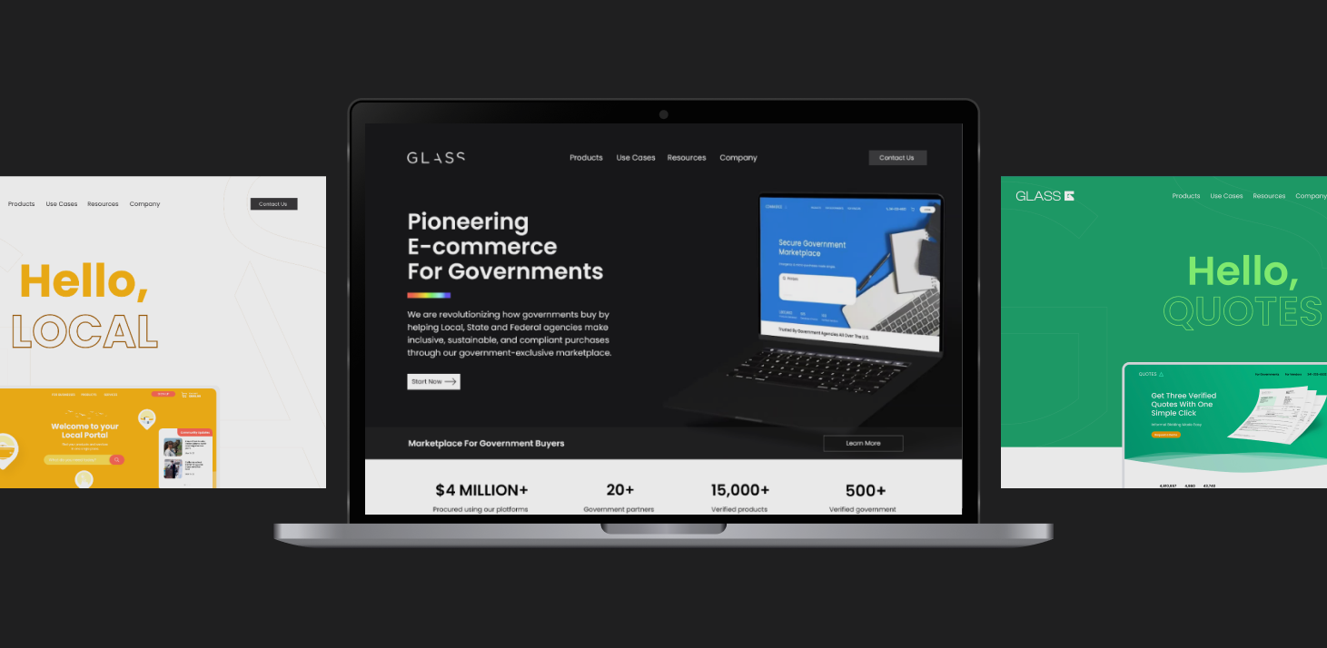
Glass is a Silicon Valley e-Commerce startup revolutionizing how governments buy. In the new landing page, we committed to creating a new experience that clearly solvethe problems below within 4 months. The beginning of an incredible journey.
contracts with
governments
User
retention
USD Found
rising archived
My Role
I led the UI/UX Design, user testing and part of the development of this project from end to end. I collaborated with other designers during ideation and prototyping stage and the guided the development team during implementation.
The Problem
By the first quarter of 2022, Only 3 to 4 demos were booked in GLASS Landing Page due to the lack of a hierarchical structure and understandable language projects;
- It has not gone through a redesign for 3 years and without a clear design language,
some sections were repetitive and with lack of content and media resources about their products. - Only limited information was provided about the products and it was difficult for users to know what they were about and where to find more info before booking a demo.
- There was no room for company achievements in terms of Use Cases, Testimonials or project showcases.Governments do not see the company could help them with their
needs.
Objective
Communicate GLASS´s value proposition, by showing their products and how it could impact governments procurements through animated user flows.
Create a clear structure of the content for the landing page so the users can understand why the should get it contact with GLASS to improve their procurement processes.
Impact
We launched the landing page on September, 2022. since the project is currently in an early stage of production, we have limited metrics about the impact, however during it first month the products demos request has increased up to 200%!
Early Adiation
We kicked off a design sprint together with the sales team and the CEO of the company to better understand the different scenarios they face while performing a demo with our clients.
After 2 live sessions, we established 4 design principles for the landing page to make sure we design based on these principles. These principles are centered around our consumers and How consumers portray us as a brand, a new rebranding was also performed by a third party during this stage.
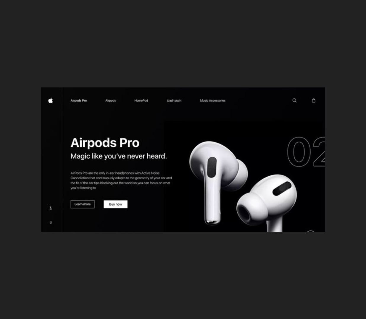
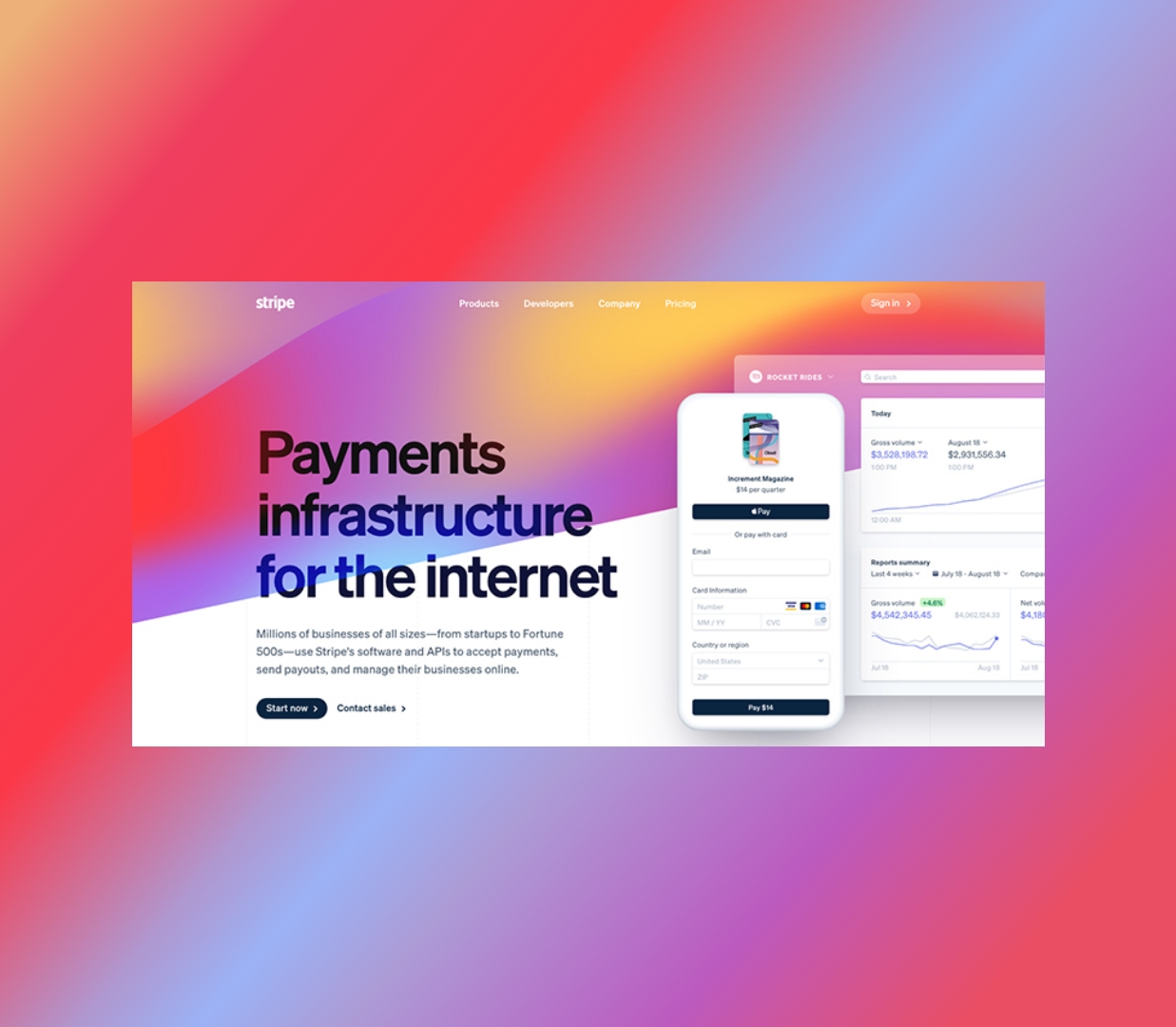
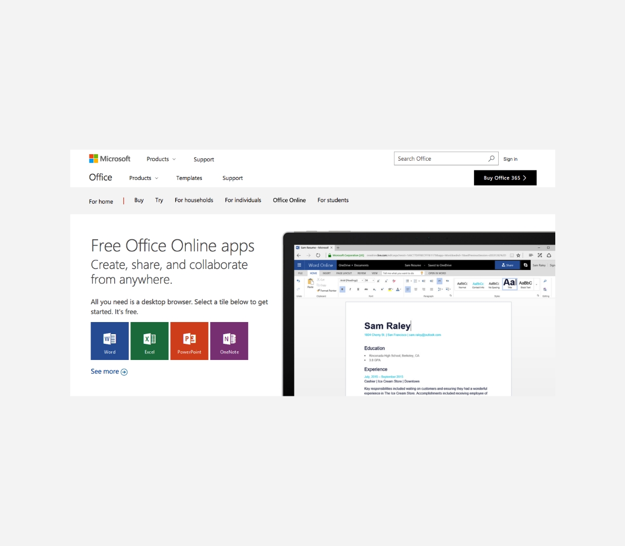
We started sketching some and testing some ideas with this new brand, some of themwere very diverse since we were implementing this new rebranding previously mentioned.
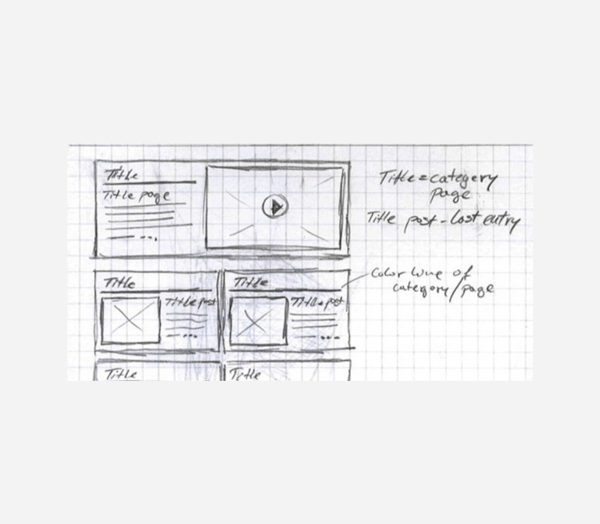

Early Wireframes
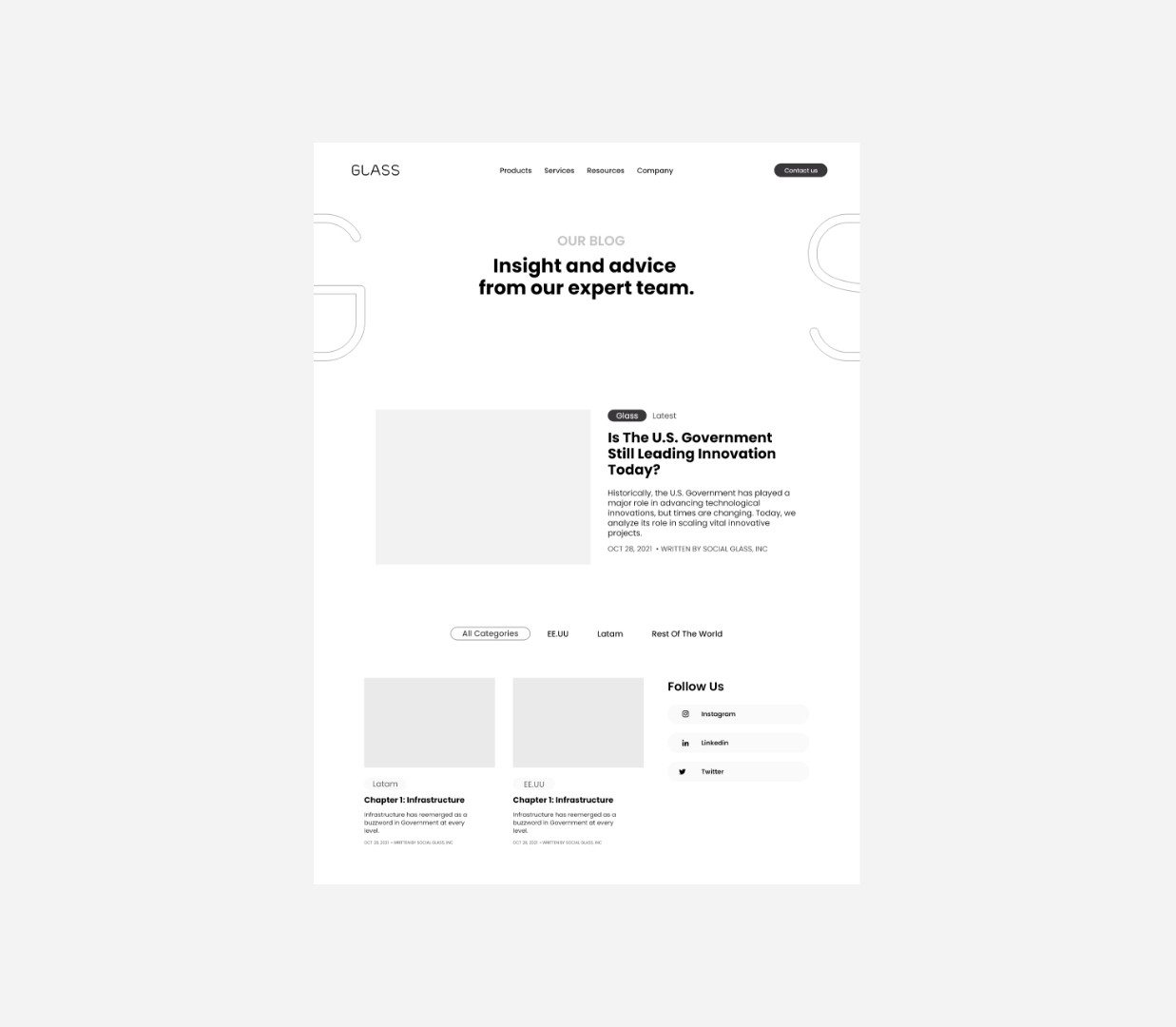
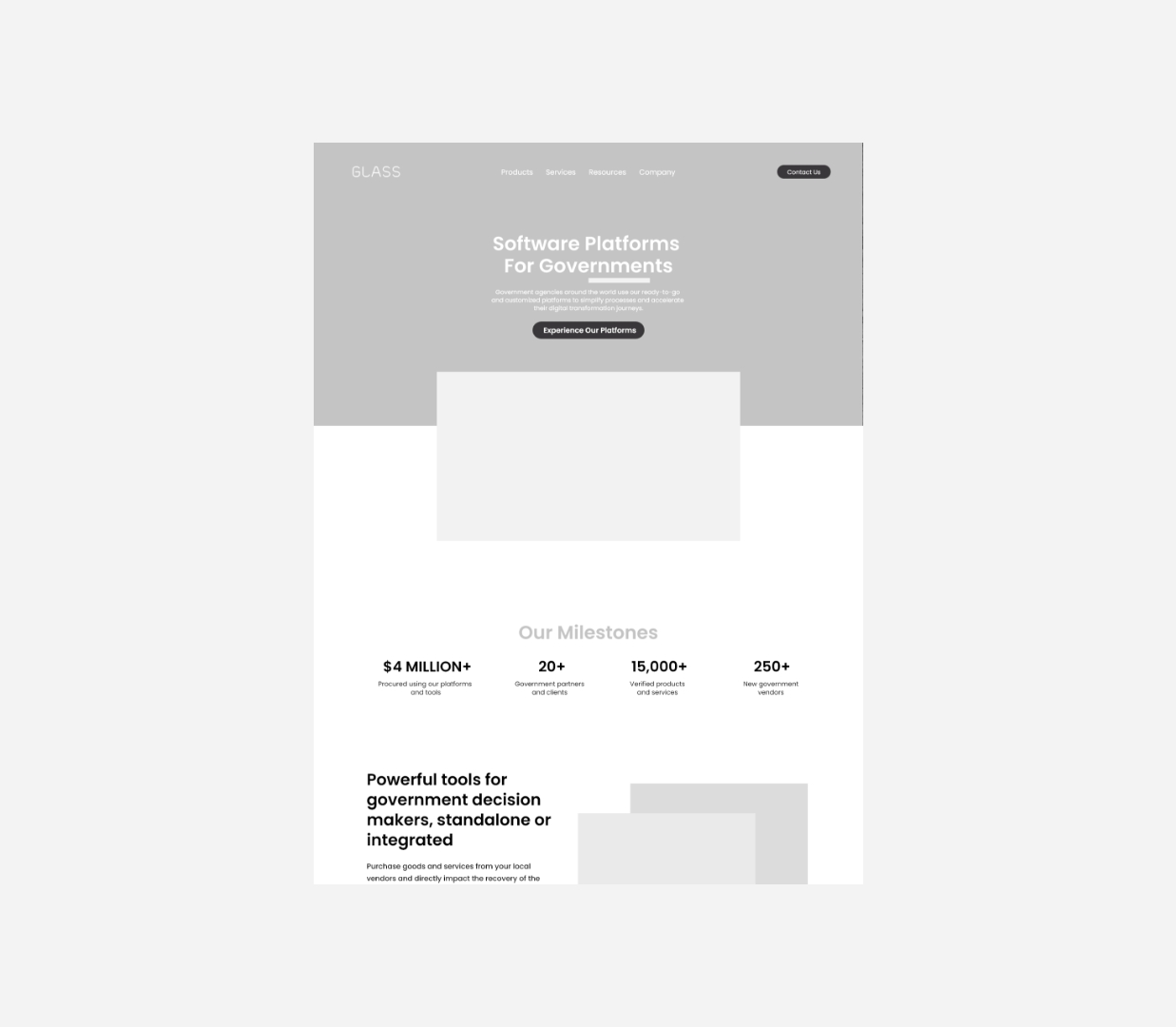
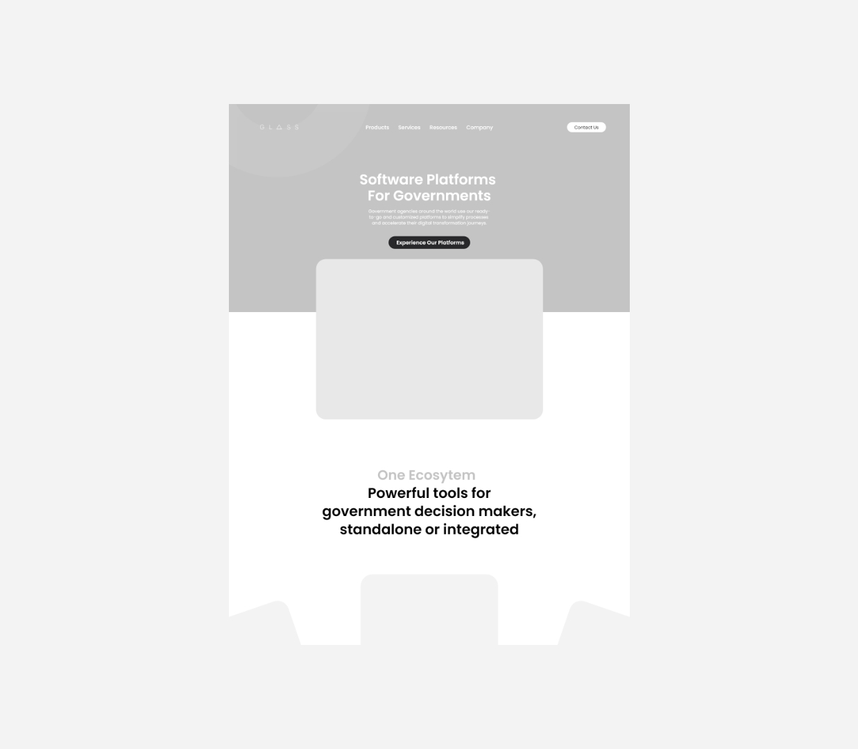
As we were implementing these early ideas into high fidelity designs demos. We experimented with different colors, shapes, layouts due to the new design re-branding that was introduced.
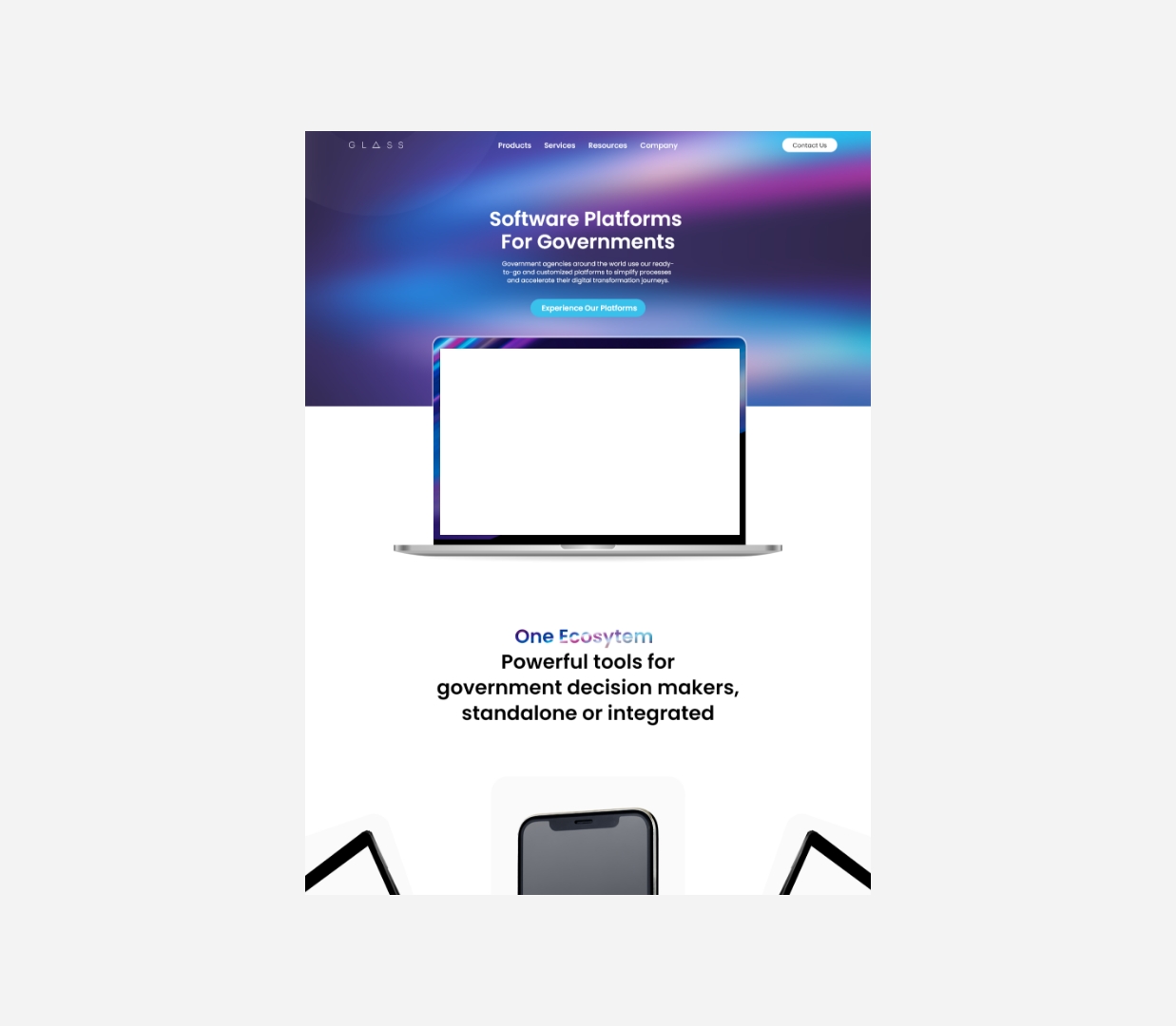
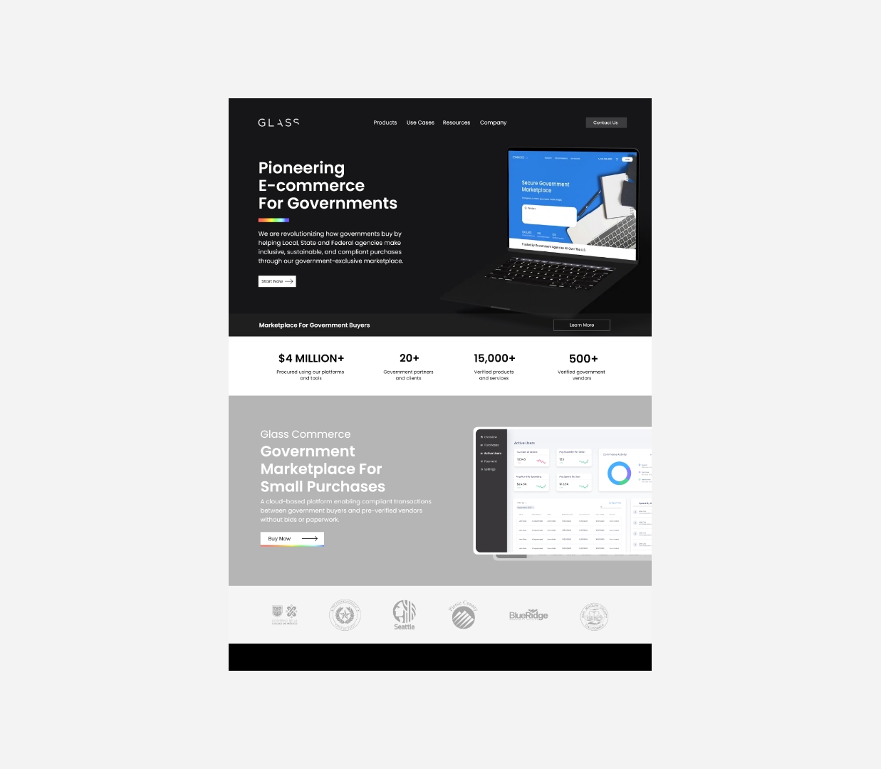
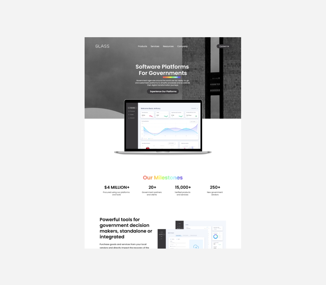
Where we started
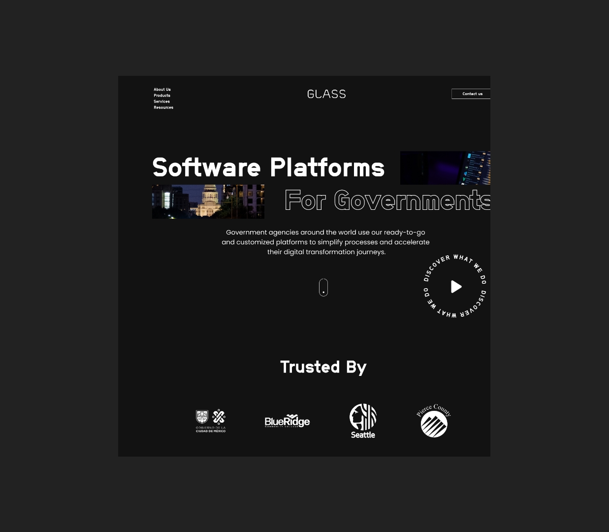
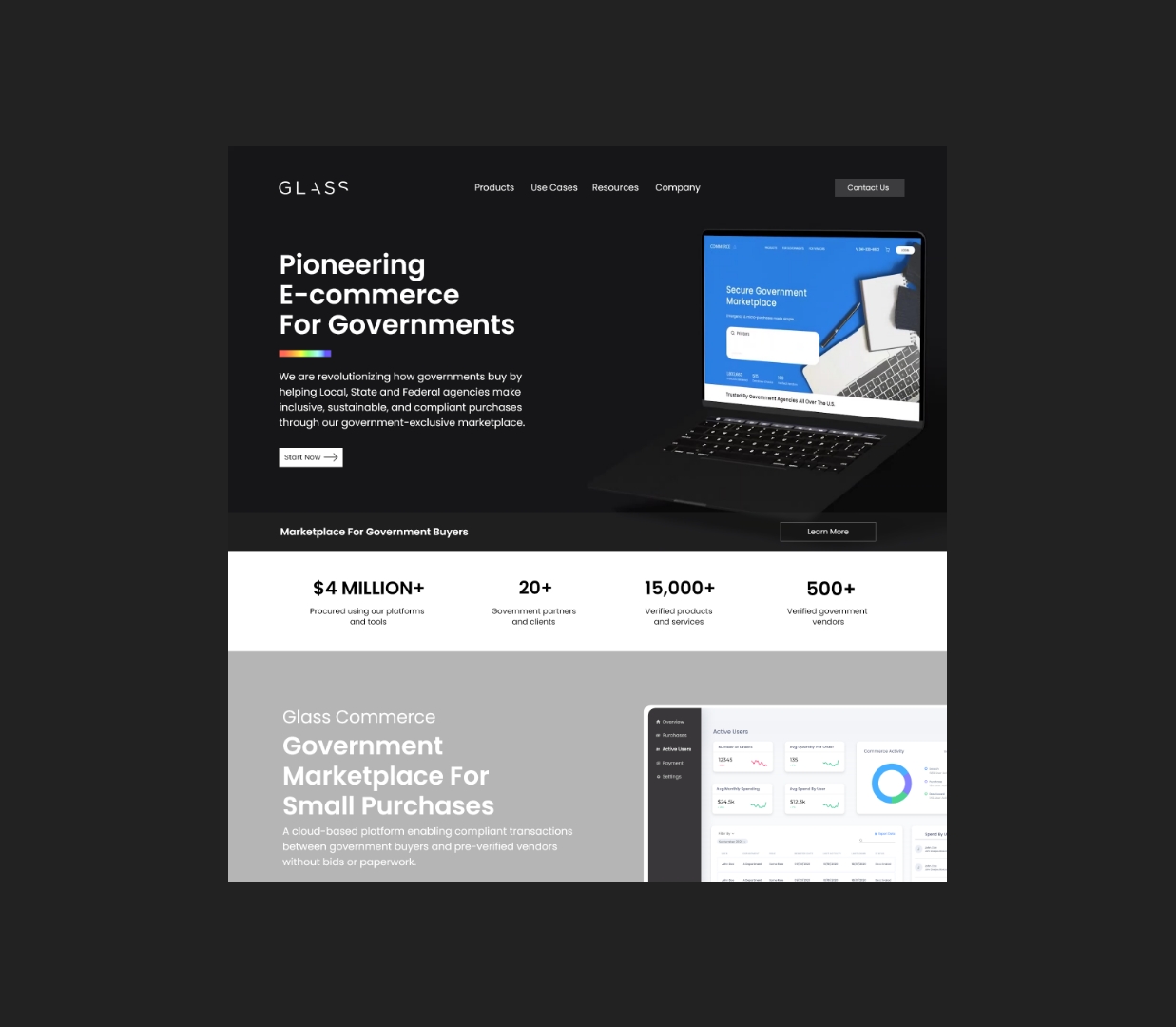
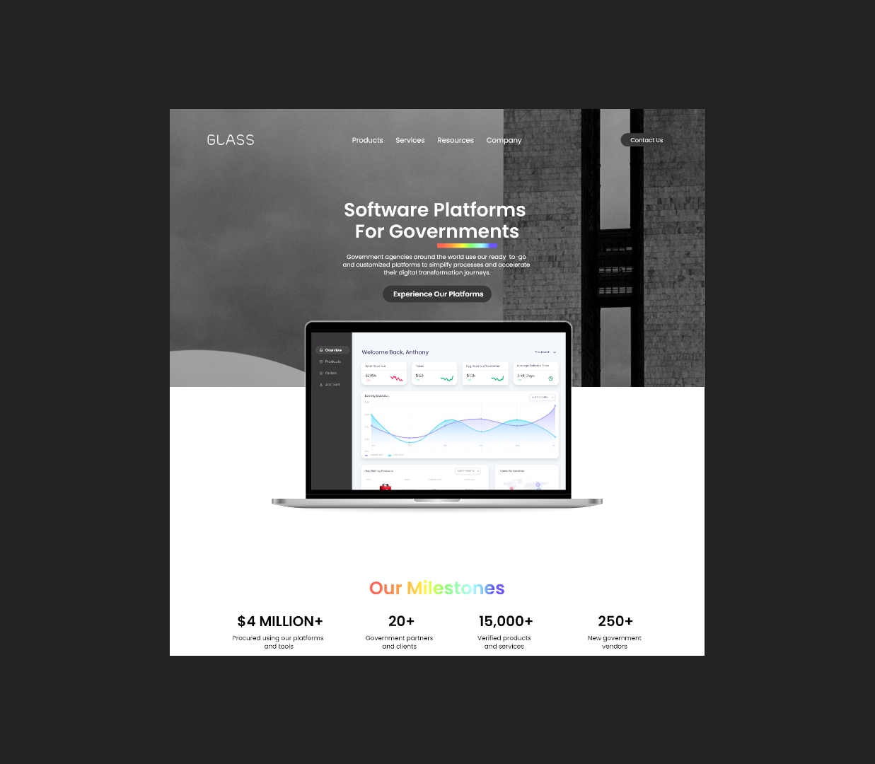
We started with 3 solid designs to kickstart the user test and also see investors and advisors reaction to the new branding, so we can learn from them what they really think about the landing page. It was a hard road however we were getting there.
User Testing
I conducted user tests with 8 people outside and from the GLASS Staff using Maze’s Survey tool and Google Forms. In that testing list I included clients that previously faced issues while exploring the website, and also the sales staff which is the user that use the platform by daily basis. Here’s a few of those questions that we asked during those interviews sessions:
63% Yes. 27% Not sure
45% 10. 55% 05
90% Yes. 10% No
70% Yes. 30% Not sure
Final Design (Before & After)
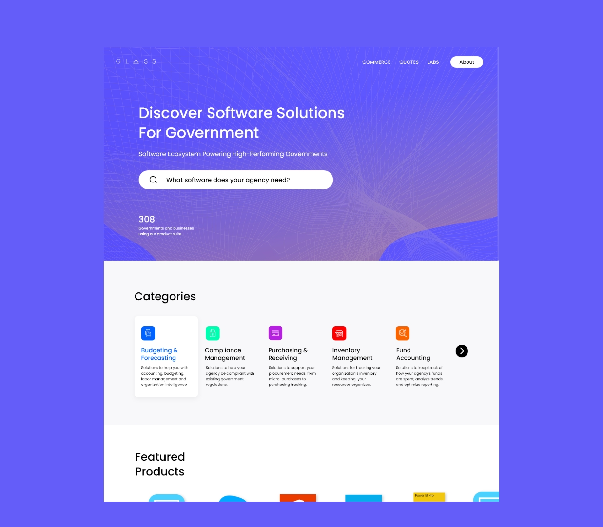
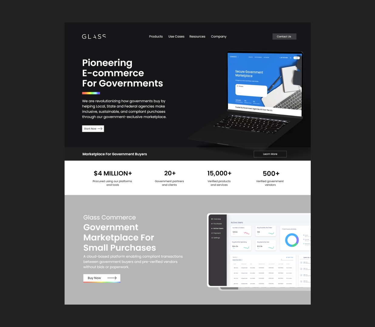
To ensure the optimal functionality and performance of each component, we initiated a prototyping phase. This involved replicating existing screens for Johnson & Johnson products, incorporating the newly defined styles, text, colors, input fields, buttons, etc. Subsequently, we organized several sessions involving developers, designers, and stakeholders aimed at refining every aspect of these new components. As a result of these collaborative efforts, adjustments were made to optimize the sizing and color hierarchy across each project.
Other Resources Implemented
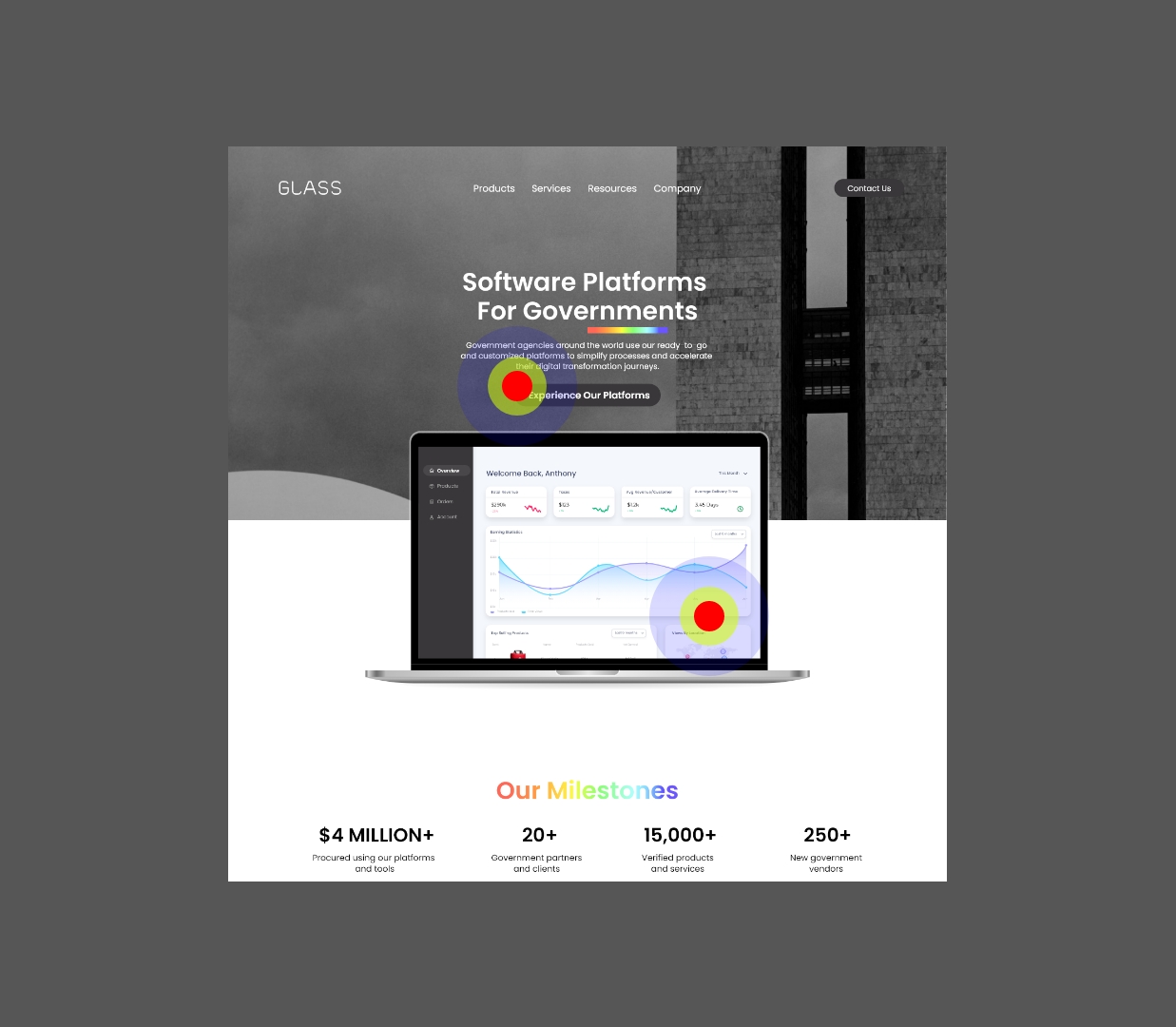
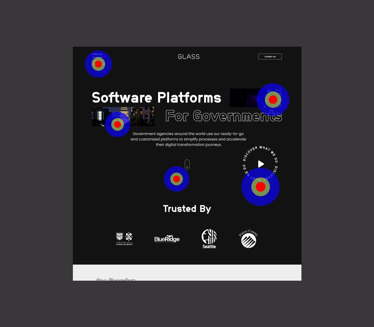
From the heatmap, we found that 65% of users stayed at the header with out exploring the entire website. We were worried that people clicked non function elements from the design and that gives the sense of “Incompleted” or “Missing Funtions”